Fri, Dec 11, 2009, 3:04am
Quick Ratings Fix for App Store
Computers » iPhone / iPad

T
he ratings on the App Store have always been problematic, as all community-driven ratings systems on the internet are problematic. One very bad idea that Apple implemented was asking for ratings when a user deletes an app from their phone / touch. That this technique unduly skews ratings toward the 1-star side on lesser-used apps is evident when glancing thru the store.
It catches the user-product relationship at its worst moment and gathers a rating that then sticks with that app forever. There is no comparable pulse-taking for other moments of this relationship. When I start or finish an app that I use every day, there's isn't a little dialog that comes up and says, "We note that you use this program a lot and have not rated it yet, would you like to rate it now?" to gather positive reviews, or a message that says, "We note that you haven't touch this app for a month, would you like to rate it now?" to gather possibly mediocre reviews (equally as valuable as the 1 or 5 star ratings).
Of course, people would throw their phones at the wall if it was constantly asking them for app reviews, so Apple would be right not to implement those ideas, but they also should ditch the review-on-delete dialog. So what could help?
Here's my $.02…
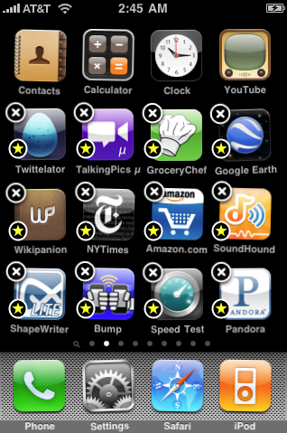
Click-and-hold is a standard gesture when moving or deleting an app, but this is also a great way to allow the user to quickly give a star rating to any app. This would capture a far more representative set of data about how users feel about their apps. It's not a thing people do very often, so it's not a substantial annoyance on the interface when all the apps are doing the little jiggle they all do in this mode.
This seems like a good idea in general, but the downside seems to be that my little attempt at just such an interface seems a bit busy. Not terribly busy, but I can see the argument that the target area for a person's finger gets too fine-grained in my mockup. That said, I whipped that up in a few moments, and I'm sure Apple could figure out something exceedingly elegant in its place.
Perhaps replace the x and the star icons to the right with a single, more general-purpose badge that can then bring up a sheet for deleting, rating, or other functions that perhaps Apple has wanted to make available, like a quick way to report a problem or contact the maker of the app.
If anyone from Apple reads this, consider something along these lines.
Everyone, and I mean everyone (users, developers, Apple), will benefit from it.