Mon, Sep 22, 2008, 1:03am
iGraffiti Art: Volume III
Programming » iOS » iGraffiti
V
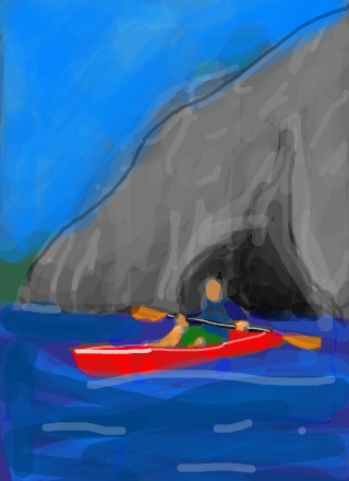
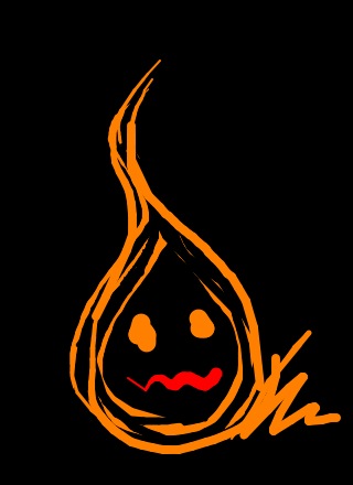
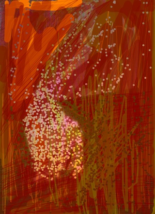
olume III of user contributions to the Art Space, all created using our iPhone app, iGraffiti. This set is from July 25th thru August 5th. There's no theme to this bunch, which may be all for the best. It's a random set showing interesting different directions.
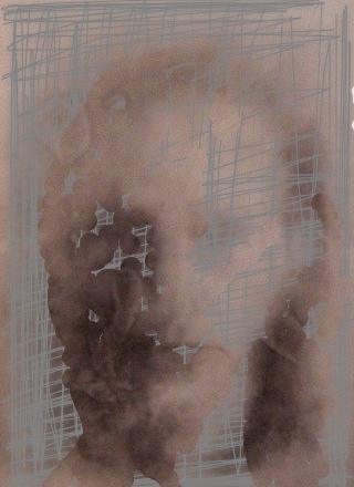
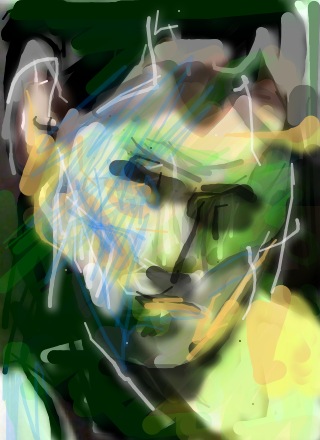
The scratchy, glass-like image to the right has a wonderful ghostly feel to it. I'm really not sure how it was done still. I can imagine the following happening: a photo is taken of someone, then a solid transparent layer drawn on top. Save the image, then load it as a background image, scratch on top of it with a thin brush, then erase the areas of the face. If that's not the technique, then I'm stumped, but it's a very nice effect.
The scratchy, glass-like image to the right has a wonderful ghostly feel to it. I'm really not sure how it was done still. I can imagine the following happening: a photo is taken of someone, then a solid transparent layer drawn on top. Save the image, then load it as a background image, scratch on top of it with a thin brush, then erase the areas of the face. If that's not the technique, then I'm stumped, but it's a very nice effect.
Link to Big Stone Phone's iGraffiti on the iPhone (only $5) available via the iTunes App Store here!